Digital transformation requires orientation. And that's exactly what our new design aims to achieve. With the rebranding, we have further developed the visual identity of NELTA – not to be louder, but to show more clearly what we stand for: quality, safety and a partnership-based digitalization for medium-sized businesses.
Why we revamped our brand appearance
In recent years, NELTA has evolved: in content, technology, and structure. Our range of services has grown, our network has become broader, and our quality expectations have risen even higher. At the same time, medium-sized companies today expect more than just expertise. They need a partner that provides orientation, reduces complexity, and reliably guides them through transformation processes.
Our old design did not fully convey this expectation. Therefore, we sharpened our branding: calm, precise, reduced. A design that precisely reflects what our clients appreciate about us: clarity in thinking, focus in action, and quality in implementation.
A logo that encapsulates what defines us
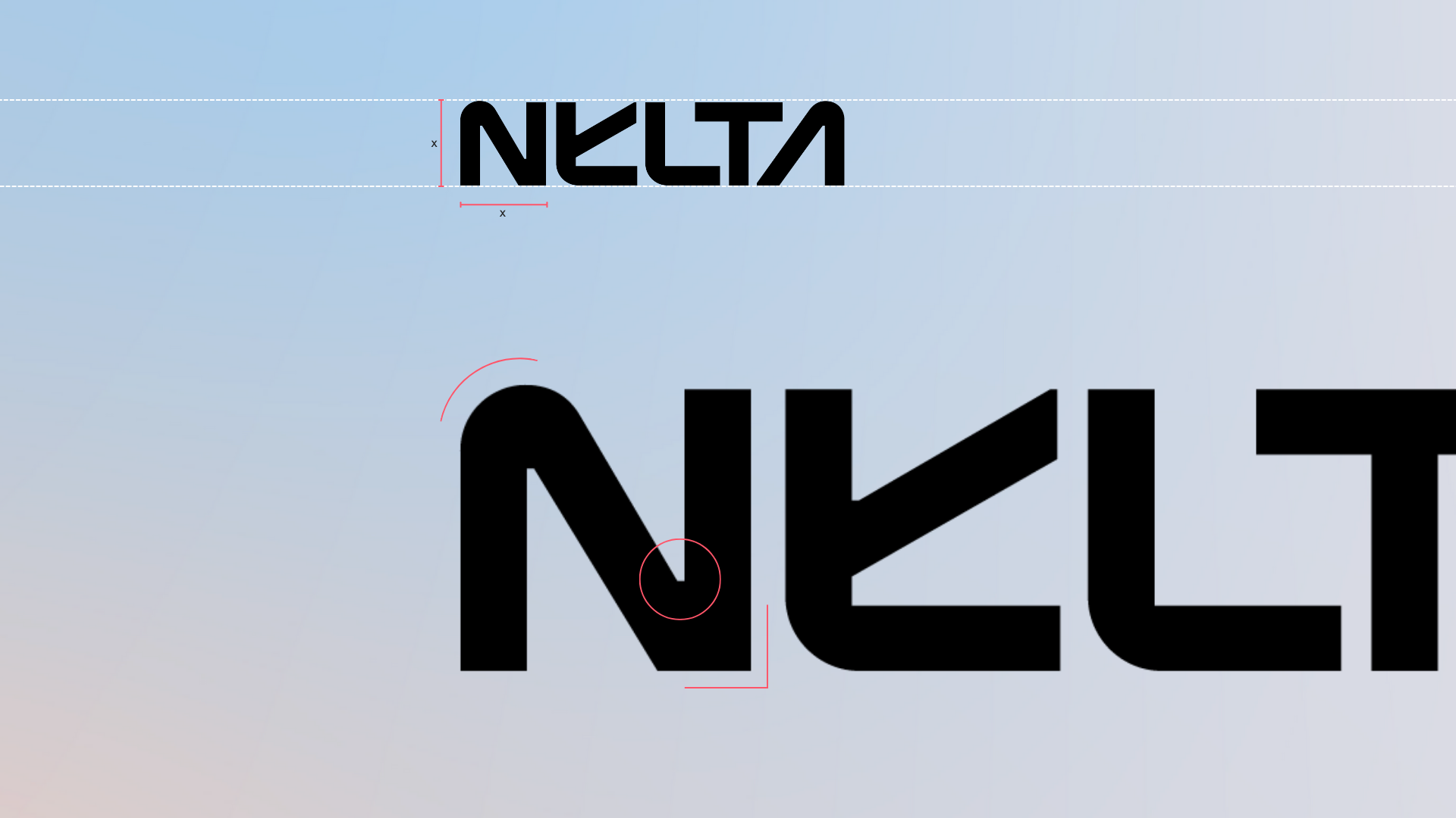
The new NELTA logo is a clear statement.
Straight lines, functional shapes, a confident “N”. No effects, no distractions. The design reflects how we work: structured, responsible, and with a high demand for technical precision.
The logo is not just a brand. It is a signpost. Internally as well as externally.